Time Circuits — Architecture
An iOS + macOS clock rendered as the BTTF DeLorean time display
Platforms
Single target, native on both platforms — not Mac Catalyst, not
Designed-for-iPad. The binary is a real Mac app with proper window
chrome. Only three iOS-only SwiftUI modifiers (EditMode,
.navigationBarTitleDisplayMode, and the
.navigationBarDrawer search placement) need
#if os(iOS) shims; the rest of the source — all 16
Swift files — compiles unchanged on both.
View hierarchy
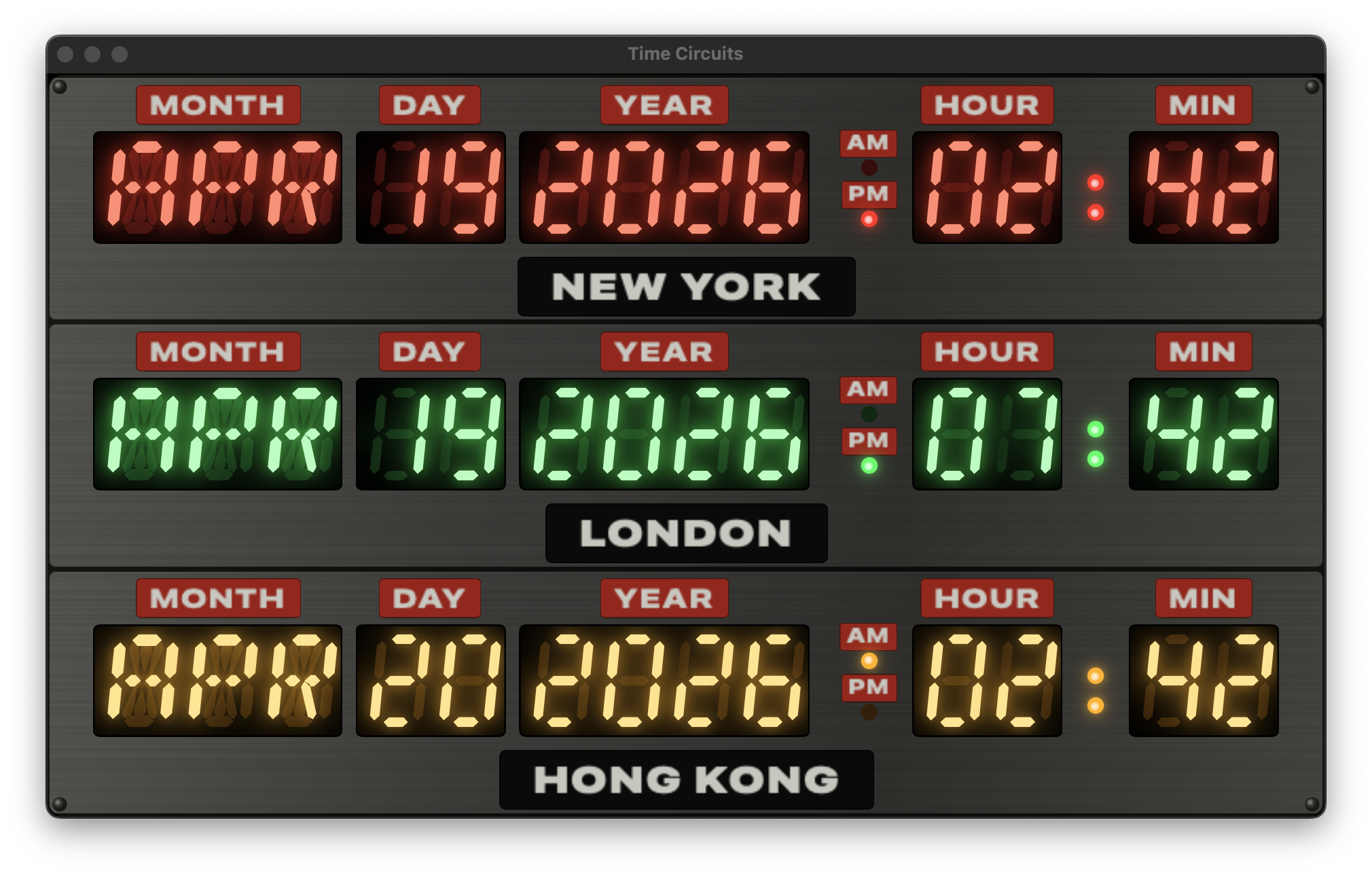
Three rectangular grey brushed-metal tiles (RowPanel)
sit on a darker chassis (DashboardEnclosureView), each
tile hosting an identical TimeCircuitRowView coloured by
its slot index.
graph TD
  App["BttfclockApp @main
(defaultSize 520×335 on macOS;
owns showSettings state;
⌘, menu command)"]
  CV["ContentView
(CityStore + ClockViewModel;
receives showSettings Binding)"]
  TC["TimeCircuitsView"]
  DE["DashboardEnclosureView
(dark chassis + rivets)"]
  RP1["RowPanel (red tile)"]
  RP2["RowPanel (green tile)"]
  RP3["RowPanel (amber tile)"]
  TR["TimeCircuitRowView
(aspectRatio scaled)"]
  FD["Date field block
(MONTH · DAY · YEAR)"]
  AP["AmPmIndicator
(AM/PM stacked)"]
  TF["Time field block
(HOUR · : · MIN)"]
  CP["City plate
(grey-on-black)"]
  CS["ColonSeparator
(step-tick, wall-clock)"]
  SET["SettingsView (.sheet)"]
  ADD["AddCityView"]

  App --> CV
  CV --> TC
  CV -.sheet.-> SET
  SET --> ADD
  TC --> DE
  DE --> RP1
  DE --> RP2
  DE --> RP3
  RP1 --> TR
  RP2 --> TR
  RP3 --> TR
  TR --> FD
  TR --> AP
  TR --> TF
  TR --> CP
  TF --> CS
Row layout — the seven blocks
Each row lays out seven visual blocks horizontally, aligned to the
bottom of the digits. A wider gap between YEAR and
AM/PM creates the date/time seam seen on the real prop.
graph LR
  MO["MONTH
plate + 3×14-seg"]
  DA["DAY
plate + 2×7-seg"]
  YE["YEAR
plate + 4×7-seg"]
  SE(("date/time
seam"))
  AP["AM/PM
2 stacked plates + lamps"]
  HO["HOUR
plate + 2×7-seg"]
  CO["colon
(step-tick)"]
  MI["MIN
plate + 2×7-seg"]

  MO --> DA --> YE --> SE --> AP --> HO --> CO --> MI
LED segment rendering
Every glowing character on the clock — whether a digit or a letter
— is a hand-drawn SwiftUI Shape, not a font. Drawing the
beveled bars from scratch lets us precisely layer the ghost, lit, and
glow passes, and the result scales crisply at any size.
7-segment anatomy
The numeric displays (DAY, YEAR, HOUR, MIN) use the classic seven
beveled bars. Each segment maps to one bit in a UInt8
mask — bit index matches the A–G naming.
UInt8 mask. All segments lit renders an "8".14-segment anatomy
The month field uses the wider 14-segment layout so letters like
M, N, V, W, and
K can render their characteristic diagonals. The bit
indices continue from the 7-segment layout — A–F for the outer bars,
G1/G2 for the two middle half-horizontals, I/L for the centre
verticals, and H/J/K/M for the four diagonals.
UInt16 mask. Diagonals (H, J, K, M) shown faint — they only light for letters like M, N, V, W, X, Y, Z, K and slashed-0.From character to path
Each character goes through a simple pipeline: the character key is
looked up in a compile-time table to get its bitmask, the mask is
passed to the Shape, and the Shape emits a Path containing
just the beveled bars whose bit is set.
graph LR
  IN["Character
e.g. 'A', '5', 'O'"]
  MAP["SegmentMaps.mask(for:)
table lookup"]
  MASK["UInt8 / UInt16 bitmask"]
  SHAPE["SevenSegmentShape /
FourteenSegmentShape"]
  PATH["Path (union of beveled bars)"]
  VIEW["SevenSegmentDigit /
FourteenSegmentChar
(stacks 3 layers)"]

  IN --> MAP --> MASK --> SHAPE --> PATH --> VIEW
Examples
'5' → 0b0110_1101 — lights A, C, D, F, G.'0' (7-seg) → 0b0011_1111 — every segment except the middle.'A' (14-seg) → 0x00F7 — outer minus D, plus G1/G2.Beveled bar geometry
Every segment is a chamfered hexagon: two parallel sides running the length of the bar, each end tapering to a single point. Geometrically, for a horizontal bar of length L and thickness t the six vertices are:
b = t/2.The bevel reproduces the pointy tips of DSEG-family LED fonts — the
shape most commonly used on screen-accurate BTTF prop builds.
PathBuilder has three methods, one per bar orientation;
all three emit the same six-vertex polygon, only the axes differ.
Italic skew
The screen-used prop's LED displays are italicised — the characters lean right by roughly 6–10°. We bake the shear into the path at construction time rather than wrapping each character in a transform, so the resulting geometry plays nicely with gradient fills and stroke widths.
dx = italicSkew × (height − y). The baseline doesn't move; only the top shifts right.Ghost + lit + glow layers
Each character view is a ZStack of three layers. The
bottom "ghost" layer paints all segments in a dim, row-tinted
colour so unlit segments stay faintly visible — matching a real LED
display seen through a coloured plexiglass gel. The middle "lit"
layer paints only the segments the current character needs, in a
pale bright core colour. The top three .shadow modifiers
stack to produce the bloom halo.
color.ghost — always visible.color.litCore..shadow modifiers at radii 2, 5, 11 turn the lit layer into an LED halo.Segment geometry constants
All sizing lives in SegmentGeometry inside
Views/Components/SegmentShapes.swift. Changing any one
of these ripples through the whole clock.
| Constant | Value | Effect |
|---|---|---|
thicknessRatio | 0.18 | Bar thickness as a fraction of the shorter char side. Matches DSEG14 Classic Italic. |
italicSkew | 0.10 | Right-lean as a fraction of height. ~6.8° of shear. |
sevenSegAspect | 0.58 | Width / height for one 7-segment digit box. |
fourteenSegAspect | 0.68 | Width / height for one 14-segment letter box (wider to fit diagonals). |
Colon step-tick
No withAnimation — a TimelineView(.animation)
subscribes to display frames and passes context.date
to a pure step function that returns true or
false directly from sub-second wall-clock time.
static func isLit(at date: Date) -> Bool {
    let t = date.timeIntervalSince1970
    let phase = t - floor(t)
    return phase < 0.5
}
Lit for the first half of every second, unlit for the second half. The switch is instantaneous — matching the way real multiplexed LEDs behave — so you can feel each second tick over. The dim state isn't fully off: the ghost circle stays visible underneath, giving the impression of the dark side of an LED rather than a pure-black gap.
:xx.5, never drifting.Because the state is computed from an absolute Date
(not an accumulating timer), the colon keeps ticking correctly even
if ClockViewModel is pinned by a -frozendate
launch argument — the display readouts freeze but the colon still
counts real seconds.
Responsive row scaling
Each TimeCircuitRowView scales as a single aspect-
ratio-preserving block. The same binary renders at ~1× on a 393pt
iPhone and at ~1.8× on a 700pt Mac window without the row feeling
squashed or stretched.
.scaleEffect handles the rest.Under the hood: compute the natural size, use GeometryReader to
measure the offered space, scale to the smaller of width/height fit,
and fix the aspect with .aspectRatio so the parent can
only offer a correctly-shaped slot:
GeometryReader { geo in
    let scale = min(geo.size.width / nat.width,
                    geo.size.height / nat.height)
    VStack(spacing: 3) {
        displayRow.frame(width: nat.width, height: rowHeight)
        cityPlate
    }
    .fixedSize()
    .scaleEffect(scale, anchor: .center)
    .frame(width: geo.size.width, height: geo.size.height)
}
.aspectRatio(nat.width / nat.height, contentMode: .fit)
On iOS, ContentView caps the enclosure at
maxWidth: 700 so on iPad landscape it doesn't blow up
into a billboard. On macOS the cap is removed — the enclosure fills
the window, and the window itself is sized at the clock's natural
aspect (~1.55:1, .defaultSize(520×335)) so there's no
letterboxing and essentially no border around the panels.
Data flow each second
The 1Hz tick updates the readouts; the colon draws on a separate
TimelineView at ~60Hz so its step-toggle is phase-locked
to wall-clock seconds.
sequenceDiagram
  participant Timer as Timer.publish (1Hz)
  participant VM as ClockViewModel
  participant CV as ContentView
  participant Row as TimeCircuitRowView
  participant TL as TimelineView (.animation)
  participant Colon as ColonSeparator

  Timer->>VM: tick (new Date)
  VM->>VM: @Published now = date
  VM->>CV: body invalidated
  CV->>VM: readouts(for: cities)
  VM-->>CV: [TimeReadout × 3]
  CV->>Row: render(cityLabel, color, readout)
  loop every animation frame (~60Hz)
    TL->>Colon: context.date
    Colon->>Colon: isLit = phase < 0.5
    Colon->>Colon: dotStack(lit:)
  end
Settings flow
The store caps at 3 cities and publishes changes immediately. Any
edit updates the running displays the moment the sheet dismisses.
Persistence is a simple [String] of city IDs in
UserDefaults.
graph TD
  U["User"] -->|iOS gear button
or macOS ⌘,| S["SettingsView"]
  S -->|drag handle| M["CityStore.move(from:to:)"]
  S -->|swipe left| D["CityStore.remove(at:)"]
  S -->|Add city| A["AddCityView"]
  A -->|tap city| AD["CityStore.add(city)"]
  S -->|Reset| R["CityStore.resetToDefaults()
→ NY · London · HK"]
  M -.persist.-> UD[("UserDefaults
bttfclock.selectedCityIds.v1")]
  D -.persist.-> UD
  AD -.persist.-> UD
  R -.persist.-> UD
  UD -.reload.-> CS["CityStore on next launch"]
On iOS, a "CITIES" gear button sits below the enclosure and
presents the sheet. On macOS there's no on-screen gear — the clock
fills the window. The settings sheet is reached via the app menu
(⌘,) thanks to a
CommandGroup(replacing: .appSettings) in
BttfclockApp's .commands block. Because the
menu command can't see ContentView's internal state, the
showSettings flag is owned by BttfclockApp
itself as @State and passed to ContentView
as a @Binding; the sheet still presents from
ContentView.
Platform shims
Platform-specific code is confined to four files, behind
#if os(iOS) / #if os(macOS) gates. Every
other file compiles identically on both. The iOS-only shims at the
bottom of SettingsView.swift use view-modifier
extensions so the main view body stays free of #if
scaffolding.
| Shim | iOS action | macOS action |
|---|---|---|
.inlineNavigationTitle() |
.navigationBarTitleDisplayMode(.inline) |
no-op (title renders in window titlebar) |
.platformSearchable(text:) |
.searchable(placement: .navigationBarDrawer(...)) |
.searchable(text:) default placement (toolbar) |
.forceEditModeActive() |
writes EditMode.active to the environment |
no-op (native Mac List has its own reorder/delete affordances) |
Platform divergence beyond the shims
| File | iOS | macOS |
|---|---|---|
BttfclockApp.swift |
no .defaultSize, no .commands |
.defaultSize(520×335),
.windowResizability(.contentSize),
.commands { CommandGroup(replacing: .appSettings) }
→ ⌘, |
ContentView.swift |
enclosure centred between Spacers, capped at
maxWidth: 700, with a "CITIES" gear button
beneath |
enclosure fills window
(.frame(maxWidth: .infinity, maxHeight: .infinity)),
no gear button |
DashboardEnclosureView.swift |
padding 8h/10v, row spacing 6pt;
.fixedSize(vertical:) applied |
padding 2h/3v, row spacing 3pt;
no .fixedSize so it stretches to fill the
window |
DashboardEnclosureView.swift (RowPanel) |
content padding 8h/6v | content padding 4h/3v |
SettingsView.swift |
default sheet size | .frame(minWidth: 420, idealWidth: 460, minHeight: 480,
idealHeight: 540) so the List has room |
The result: a single binary that's a proper iPhone app in portrait and a chromeless, aspect-matched Mac window with Settings in the app menu.